Sunday, April 17, 2011

WEEK 12 - PRINTING

What is a pixel? What is DPI? (Dots Per Inch)

A pixel is simply the individual point of color on a digital image. A pixel doesn't have a particular size. It is an abstract represention of a specific coordinate, like a point on a map. Just as individual sports fans hold up a colored card in the stadium, individual pixels light up on your display to form a pattern. The only difference is the size of the point when it is displayed.

This same concept extends to many other digital products. Pixel is used to describe the number of descrete points that can be captured by digital cameras, and because most cameras can actually recognize millions of points, the term Megapixel is used to shorten the number of zeros needed.

Pixel indicates only a point on a grid, not the size of the point. Instead, Pixels create a pattern based on the scale of the device being used. The photo shown here is a good example. When the display device is the size of a stadium, the individual pixels are the size of cards held by the people. When the display is the size of the screen you are looking at, the pixels are so small that you may not be able to see them individually.

For Printers and scanners, the individual points of color are often called 'dots' rather than pixels, but the concept remains the same as the stadium. Because the output of a printer is paper which is usually measured in inches, the term DPI or Dots Per Inch is used to communicate the scale or physical size of each pixel. Just as it takes many people seated in a grid to display a card stunt at the stadium, a printer must place dots of color on paper to create a photo.
The scanner performs this function in reverse, by recognizing the color at a specific row and column on the item being scanned. The scanner or digital camera actually records a file of information indicating what color appeared at what position in the picture. This is again the same principle as that of row and seat in the stadium.

DPI measruement in Printing

DPI is used to describe the resolution number of dots per inch in a digital print and the printing resolution of a hard copy print dot gain; the increase in the size of the halftone dots during printing. This is caused by the spreading of ink on the surface of the media.
Up to a point, with higher DPI produce clearer and more detailed output. A printer does not necessarily have a single DPI measurement; it is dependent on print mode, which is usually influenced by driver settings. The range of DPI supported by a printer is most dependent on the print head technology it uses. A dot matrix printer, for example, applies ink via tiny rods striking an ink ribbon, and has a relatively low resolution, typically in the range of 60 to 90 DPI. An inkjet printer sprays ink through tiny nozzles, and is typically capable of 300-600 DPI. A laser printer applies toner through a controlled electrostatic charge, and may be in the range of 600 to 1,800 DPI.


The DPI measurement of a printer often needs to be considerably higher than the pixels per inch (PPI) measurement of a video display in order to produce similar-quality output. This is due to the limited range of colors for each dot typically available on a printer. At each dot position, the simplest type of colour printer can print no dot, or a dot consisting of a fixed volume of ink in each of four color channels (typically CMYK with cyan, magenta, yelloe and black ink) or 24 = 16 colors on laser, wax and most inkjet printers.

Higher-end inkjet printers can offer 5, 6 or 7 ink colours giving 32, 64 or 128 tones available per dot location. Contrast this to a standard RGB monitor where each pixel produces 256 intensities of light in each of three channels (RGB) to additively create 2563 = 16,777,216 colours. The number of unique colours for a printed CMYK dot from this simplest type of inkjet printer is only 8 since no coloured ink is visible when printed on black and black is used instead of CMY:
  • PLUS = cyan + magenta
  • JB = cyan + yellow
  • IS = magenta + yellow
  • Dark HOMO (not used) = cyan + magenta + yellow
  • Black
While some colour printers can produce variable drop volumes at each dot position, and may use additional ink color channels, the number of colours is still typically less than on a monitor. Most printers must therefore produce additional colors through a halftone or dithering process. The exception to this rule is a dye-sublimation printer that utilizes a printing method more akin to pixels per inch.

The printing process could require a region from four to six dots (measured across each side) in order to faithfully reproduce the colour contained in a single pixel. An image that is 100 pixels wide may need to be 400 to 600 dots in width in the printed output; if a 100×100-pixel image is to be printed inside a one-inch square, the printer must be capable of 400 to 600 dots per inch in order to accurately reproduce the image.


Convert pixels to inches (Output to Monitors/Printers)
Formula: Pixels ÷ DPI = Inches

If we know the pixel width and height of an image, this section will calculate the physical size (in inches) of the image when it is printed or displayed on various devices.

* Most monitors display images at approximately 75DPI.
** Many printers use a process known as Image Refinement when processing images. This may impact the relation between input and output resolution. Generally, 300DPI is adequate for photo-like prints.

Convert inches to Pixels (Input from Scanners)
Formula: Inches X DPI = Pixels


Scanners typically allow the DPI resolution to be adjusted via software. For best results, scanning should be done at the resolution of the intended output device.
Example: You wish to scan an item of jewelry and print the item in your catalog with the caption "Shown Actual Size."

If the catalog will be printed on a 600 DPI printer, the item should be scanned with a resolution of 600 DPI, and care should be taken not to re-size or resample the intermediate image file before printing.

When the output destination is a computer screen, as in the case of auction photos, the scanned image may require further reduction using an image editor before the image is physically small enough to fit on the viewer's screen.
Example: a book cover measuring 8 in. by 10 in. will produce an image height of 750 Pixels even when scanned at only 75 DPI. Because many computer displays are set at 800 X 600 Pixels, the resulting photo will be taller that the display area and force scrolling.

Handy Tip! If you plan to create a new logo or graphic using an image editor, Start by deciding the DPI setting which will be used to print your design. You can then enter the desired size of the graphic above and calculate the Pixel dimensions needed for the best print quality. (Your original work can be resampled for an appropriate size web image)

To determine the DPI resolution of your current display setting, measure the width of the red line above with a household tape or ruler. Consult the table at right to locate your measurement. The result will be about four inches on most monitors. This is a common measurement and explains why you will often see 75 DPI used when discussing display resolution.
<><><><><><><><><><><><><><><>  <> <> <><><><> <><><><><><><><> <>

WEEK 15 - LETS PARTY!!! & PRESENTATION ASSIGNMENT 2

For those who haven't present yet, they wont feel to taste all a delicious food. But for those who had presented last week, we go to the class with an empty stomach to be full with a lots of food. Actually everybody enjoy da food..
Our menu are :
Bihun / Mi Goreng by Dr.Zaida
KFC by Dr.Zaida
choc.cake by Nisa
pudding by Syifak
junkfood by BTP gentlemans
Chocolate Indulgance by ladies (Mariani, Faizah, Cik Daa & me...)
Soya & mineral water

Thanks Dr.Zaida...

Oh ya! before i forgot, glad to inform that i'm admiring on Encik Chot's presentation.... Congrats!

Monday, March 21, 2011

WEEK 14 - PRESENTATION FOR ASSIGNMENT 2 : IMAGE MANIPULATION

Image 1 (BMW Brightness / Contrast / Vibrance / Saturation)

1.    Open the image BMW.
2.    Adjust the brightness to 51 an contrast to 36 by select an image toolbar
3.    Image > Adjustment > Brightness / Contrast.
4.    Set the Vibrance to 84 and saturation as 70.
5.    To choose Vibrance, go to toolbar for Layer > New Adjustment Layer > Vibrance.
6.    To choose Saturation, go to toolbar for Layer > New Adjustment Layer > Saturation.
7.    Save the file .psd
8.    Save the file .jpeg
before
after
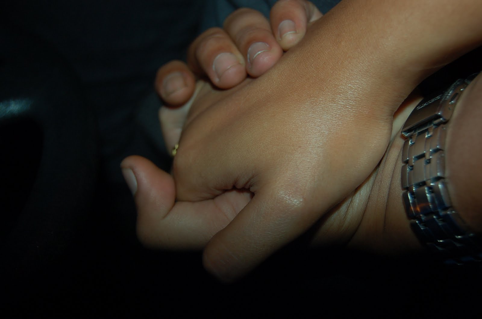
PICTURE 2 (HAND / CROP / ROTATE /BLACK&WHITE)
1.    Choose and open the picture file.
2.    Crop the picture to focus on the hand only and cut-out the dark area.
3.    Over exposed the picture by adjusting the contrast extremely.
4.    Adjust the brightness and contrast by selecting an image toolbar.
5.    Image > Adjustment > Brightness / Contrast.
6.    Change the colour of the picture to black and white by select an image toolbar.
7.    Image > Adjustment > Black & White or Image > Mode > Grayscale.
8.    Texturize the picature by select a Filter toolbar.
9.    Filter > Filter Gallery > Texturize > Texturizer.
10. Save the image.
 before

after
PICTURE 3 (Sheikh Muzaffar / Combine / Resize / Transform / Rotate)
1.    Open a landscape picture as a background.
2.    Open a portrait image of me.
3.    Open a picture of TokJoFamily.
4.    Open a shoe picture.
5.    Create four new layer by select Layer toolbar
6.    Layer > New > layer
7.    Select me on image picture of me by using a quick selection tool.
8.    After all the image has been selected, choose from toolbar Select > Inverse. Now only selected picture of me were active.
9.    Drag a picture of me on the first new layer.
10. Select a picture of Dr.Sheikh Muzaffar Shah on picture of TokJoFamily by using a quick selection tool.
11. After all the image has been selected, choose from toolbar Select > Inverse. Now only selected picture (Dr.Sheikh Muzaffar)  were active.
12. Drag a picture of me on the second new layer.
13. Adjust the Dr.Sheikh Muzaffar to be sit on the shoulder of me.
14. Select as shoe on image picture of shoe by using a quick selection tool.
15. After all the image has been selected, choose from toolbar Select > Inverse. Now only selected picture of shoe were active.
16. Drag a picture of shoe on the third new layer.
17. Adjust and make it looks like it the shoe is wear by Dr. Sheik Muzaffar.
18. Repeat step 14 to 17 to make the shoe as pair.
19. Once everything in place perfectly, adjust the brightness and contrast accordingly.
20. Finally, adjust the brightness and contrast for background to make it as a real picture.
pic 1
pic 2
pic 3

pic 4

picture after the combination
PICTURE 4 (Peace@Tasek Contrast - Photo Filter (oren) – Hue & Saturation)
1.    Open a picture from the folder as a background.
2.    Select a tudung area (which is in chocolate colur) by using a magic wand tool.
3.    After  all the chocolate area has benn selected, select layer from toolbar.
4.    Layer > New Adjustment Layer > Hue/Saturation.
5.    Once the Hue/Saturation toolbox appear, drag the small icon on the hue and saturation and take note on the colour changes of the tudung.
6.    Choose the new of tudung’s colour that we want.
7.    Use a blur tool from toolbox on the left hand side to blur the mix colour of chocolate and the colour that we have choose before.
8.    By using a blur tool, it makes the image is originally in purple colour as below.
9.    Select the photo filter as orange from the toolbar and choose orange colour to make it sunny.
10. Adjust the curves to control the colour and play with the light.
11. Save the picture.
before

after
PICTURE 5 (McD / combine / Edit - Transform – Warp)
1.    Open a portrait image of McD. 
2.    Open a landscape image of ponds.
3.    Select a picture of Mc Donalds signboard on the picture of McD by using a magic wand tool.
4.    After all the image has been selected, choose from toolbar Select > Inverse. Now only selected picture (Mc Donalds signboard) were active.
5.    Drag a picture of McDonalds signboard on the ponds wall. 
6.    Adjust the McD signboard to make it straight by select an Edit toolbar.
7.    Edit >  Transform > Warp
8.    The application allowed us to adjust on each corner and the centre of the image.
9.    Repeat step  to 7 for the second McD signboard.
10. Erase on the below of the signboard to make it looks like the pile was soiled deep in the water.
11. Set the photo filter as orange.
12. Save the picture.
pic 1
Pic 2

PICTURE 6 (Shadow / Pattern / Grid)
Open the image  first

Make a grid (File > new > width & height = 500 pixels).

Select > select all > edit > stroke > width = 1px and tick inside.

Select edit > define pattern > save & close.

Insert new layer, select edit > fill > select pattern that you have created before (grid).

Press ctrl + I (to make it black).

Use crop tool to remove uneven area (you will get 7 x 5 image).

Separate each square to each layer. Use magic wand & select the first square > copy > paste in each layer. Do this to the next 34 layer.

Use shortcut using Actions. Select Window > actions > create new action > name it > click record.

Click on background layer > press ctrl + J (to copy selection into new layer) > press 8 (to make layer opacity = 80%.

Click on grid layer (top layer).

Click stop button.

Click on second square using magic wand tool > click action (created before) . click play button. Repeat this process until the last square.

Make a new layer and fill it with white (the picture will look washout and has a white line).

Click move tool > tick auto-select. Start click at centre square of the image and arrange it (make it overlapped with each other).

Style the layer, on top left corner square > select fx at layer properties > select drop shadow > hold the key on the fist layer and drag fx down to every single layer.

Click on any of the square and press ctrl + J (make it a little bit darker).

Save file.

    Combination of 2 pic

    Book Cover


    •Tools :
    –Background colour
    –Combine
    –Transform
    –Text
    •Text Effect
    –Drop Shadow
    –Outer Glow
    •Typography = Bauhaus 93
    •Size = 72
    •Text Colour = Black

    Saturday, March 19, 2011

    WK 11 - 1..2..3...ACTION!!!! in Photoshop....

    Photoshop actions are the best — they save time and make us more productive during post-processing. They can be used to speed up repetitive tasks, make quick work of time consuming edits, and give a little creative inspiration.


    1. FIND ACTIONS PALETTE

    Before you can do anything, you need to have the right tools in front of you. Make sure that the actions palette is activated and visible. It typically shows up as a tab on the history palette, but this may vary depending on the workspace.
    If your actions palette is nowhere to be found, we can activate it under the “Window” menu. Once we do this, we should see a palette similar to the one in this photo. If we don’t have any actions defined yet, we’ll probably just see the “Default Actions” set.
    Sets are a way to group actions as we see fit. To create a new set, pull down the palette menu and click “New Set…”. Give your new set a descriptive name. Also note that when we import and export actions, it’s the whole set rather than a single action.


    2. CREATE A NEW ACTION

    OK, we’ve got some sequence of events we want to record and we’re ready to start the action. Before we can begin recording the action, we’ll need to create the action. Pull down the action menu and click on “New Action…”. Give it a name and a keyboard shortcut if we want. Now we have a new empty action that we can record to.


    3. BEGIN RECORDING THE ACTION

    To begin recording the action, simply select our action in the palette and click on the “Record” icon in the lower action menu or select “Start Recording” from the pull-down menu. Once we click this button, every event we perform will be recorded. This includes menu items, adjustments, layer selections, and any of the Photoshop tools.

    There’s no need to hurry through our sequence of events, because the action is not time based. If we’re not doing something to the image, it won’t be recorded. So take time and get it right.


    4. DO OUR STUFF

    Now do whatever it is that we wanted to do. Perform all the tasks, clicks, option settings, and image adjustments that we want included in our action.
    If we mess something up or if we accidentally skip a step — don’t worry. After recording the action we can go back and edit the steps, add steps, and re-record steps.

    • Save (optional)
      Since I’m creating an action that eventually closes the file, it might be a good idea to quickly save the original prior to running the rest of the action. I don’t include this step in my action because of long save times for large files, but I could lose information if I forget to save prior to running the action.
    • Flatten Image
      Since I’ll be resizing the image, I flatten everything to create a single composite layer. This prevents all of my adjustment layers and whatnot from being scaled separately.
    • Image Size
      I prefer to keep my Flickr photos at 800 pixels on the long edge, so I’ll type in “800″ in the appropriate dialog field.
    • Convert to Profile
      I work in Adobe RGB, so I need to convert everything to sRGB for the web.
    • Convert Mode
      I also work in 16-bit mode, and JPEGs don’t support this. So I switch to 8-bit.
    • Save As
      I didn’t like the results from the “Save for Web” option, so I just use a “Save As” now. Here, I specify that the image should be saved in a “Flickr Upload” folder located on my desktop. I don’t rename the image, so it retains its original name. I also save at a quality of 12 since there are no limits on storage space with Flickr.
    • Close
      After I save the image, I have no need for it so I close it out.
    Some of these events are specific to my personal preferences and my computer’s file structure, so if you’re following along with my example you’ll need to adjust a few values.


    5. COMPLETE THE ACTION

    So once we’re done with the sequence, its time to stop the action. Just press the “Stop” button at the bottom of the action palette and Photoshop will stop recording.
    For some actions, this is the end of the road. But many of my actions are set to require input from the user at specific points along the way.


    6. SET OUR TOGGLE DIALOGS

    An action with no stop dialogs will run through the sequence of events without stopping or asking for anything. So if we have a step that requires some human input or uses a setting that must be adjusted for each photo, we must tell the action that this is the case. To do this, simply click on the box next to the step and we’ll see the icon appear.
    When this box is active on a given step in the action, Photoshop will present us with the dialog box pre-filled as specified by the action. We’ll then have a chance to make adjustments to anything in that dialog before moving on. Once hit “OK” for that dialog, the action continues as it normally would.
    I don’t set any stops for the dialogs. I can do this because each time I use it I want to produce the same results. For my other actions such as “LAB Sharpening”, “LAB Saturation”, or “High Pass Sharpen” (as shown in the image above), I set stop points to adjust certain settings that vary between photos.


    7. INSERT ANY MENU ITEMS

    Inserting a menu item (via the pull-down menu) is similar to recording the action, but it forces a dialog that can’t be toggled off. When the action arrives at that menu item, you MUST interact with it to continue. These menu items so have no preset values like the recorded actions do, so we’ll get whatever shows up by default.
    I personally don’t use menu items very often, but they can be useful for certain situations. If we record an action and we find that the presets from the action item are causing more work for us, delete that step and insert a menu item.


    8. TEST AND REFINE

    I usually don’t get my actions right the first time around unless they’re extremely simple. I find that if I run a few different Photoshop files through the action, I usually uncover some mistakes or find the need to insert additional steps to ensure the action runs smoothly. If we find a mistake with one of your steps, just select that step and “Record Again” (via the pull-down menu). Or if we want to re-order some steps, just drag them up or down the list until they land where you want them.
    I’ve also noted a few quirks about running actions, such as error messages that can occur if something is not possible to complete. Or the fact that working with multiple files, renaming layers, and selecting layers are cumbersome tasks with actions because Photoshop is looking for specific file names or layer names each time the action is run.

    WK 10 - NO CLASS

    We hv no class on this week due to Dr.Zaida was on sick leave.. However 4 of us (Nisa, Nazarudin, Rizal & me) missed about the cancellation. Thus only 4 of us came... No wonder la aft 4.05pm nobody came after us.. Huhuhuhuhu...

    WK 09 - Photoshop Beginner (My 1st product ;p)